The Mystery of the Turquoise Arches: Why the McDonald’s in ……, Isn’t Yellow
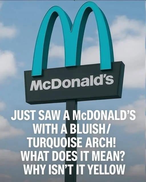
The image of a McDonald’s sign with bright, turquoise-teal arches has captivated and confused the internet. The bold text overlaid on the image asks the question on everyone’s mind: “Just saw a McDonald’s with a bluish/turquoise arch! What does it mean? Why isn’t it yellow?”
For a brand as universally recognized as McDonald’s, the Golden Arches are more than just a logo; they are a beacon of consistency, a symbol of globalized fast food that looks exactly the same whether you are in New York, Tokyo, or London. To see the iconic yellow replaced by a cool, oceanic blue feels almost like a glitch in the matrix.
However, this is not a Photoshop prank, nor is it a temporary marketing stunt. This unique sign is entirely real, and it is located in one of the most visually breathtaking locations in the United States: Sedona, Arizona.
The story behind this one-of-a-kind McDonald’s is a fascinating intersection of corporate branding, local government regulation, environmental preservation, and cultural respect. It is a story of how a global giant had to bow to the beauty of nature. This comprehensive guide will explore the history, the regulations, and the cultural significance that led to the creation of the world’s only turquoise McDonald’s. We will delve into the architectural choices, the impact on tourism, and the broader trend of how global brands adapt to local environments.
Welcome to Sedona: The Red Rock Country
To understand why the McDonald’s arches are turquoise, you must first understand the environment in which this specific restaurant is situated. Sedona, Arizona, is not an ordinary city. It is world-renowned for its stunning, monolithic red rock formations, sweeping desert vistas, and awe-inspiring sunsets that paint the sky in hues of orange, purple, and pink.
The city is a designated “International Dark Sky Community,” meaning it goes to great lengths to preserve the quality of its night sky and the natural beauty of its landscape. Sedona is a place where nature takes precedence. The aesthetic of the city is fiercely protected by local ordinances that dictate everything from the height of the buildings to the color of the exterior paint.
When you are surrounded by millions of years of natural geological history, a massive, bright yellow corporate logo can feel jarring. The city of Sedona recognized this reality early on, and they implemented strict guidelines for all commercial developments to ensure that businesses blend in with the environment rather than dominating it.
The Battle for the Golden Arches: When Yellow Becomes Too Flashy
The story of the turquoise McDonald’s began in the early 1990s. In 1993, McDonald’s was looking to build a new franchise in Sedona, specifically in the bustling tourist area of West Sedona. The company submitted its standard architectural plans, which included the classic, bright yellow fiberglass arches and a standard boxy building.
The City of Sedona, however, had other plans. City officials and the community were deeply concerned about the visual impact of the iconic golden arches. They argued that the bright yellow color would clash with the deep reds of the surrounding rocks and the natural browns and greens of the desert scrub. They wanted something that would not disrupt the view or distract drivers on the scenic highway.
The initial negotiations were tense. McDonald’s, like most global corporations, has strict brand standards. The yellow arches are a multi-million-dollar trademark, and deviating from that identity is not a decision made lightly. The company initially pushed back, arguing that the golden arches were a vital part of their brand recognition.
The Compromise: A Turquoise Solution
After lengthy discussions between McDonald’s executives and Sedona city planners, a compromise was reached. McDonald’s agreed to abandon its traditional yellow arches in favor of a color that would blend into the local environment.
The color chosen was a muted, earthy turquoise or teal. This specific color was not chosen at random.
Blending with the Sky: The turquoise arches mimic the clear, blue desert sky that sits above the red rocks.
Blending with the Landscape: The color blends naturally with the shadows and the sparse vegetation of the area, reducing visual pollution.
Aesthetic Harmony: It was a color that the city planners agreed felt “Southwestern” and didn’t scream for attention.
Furthermore, the building itself was redesigned to look like a traditional Southwestern adobe structure. Instead of the standard red and yellow plastic exterior, the restaurant was built with a stucco finish in a dusty, earthen red hue that perfectly camouflages it against the distant sandstone formations.
The result was a building that looked like it belonged in Sedona. The turquoise arches became a small, acceptable beacon, rather than an aggressive corporate intrusion.
The Cultural Significance of Turquoise
Beyond the aesthetic regulations, the choice of turquoise holds a deeper cultural resonance in the American Southwest. Sedona is located in a region rich with Native American history and culture, particularly that of the Navajo, Hopi, and Yavapai-Apache nations.
In Native American traditions, especially among the Navajo, turquoise is considered a sacred stone. It is known as the “sky stone” and is believed to possess protective properties, bringing good fortune and spiritual harmony. It is a stone of communication and wisdom, often used in traditional jewelry and ceremonies.
By choosing turquoise for the arches, the McDonald’s in Sedona inadvertently (or perhaps intentionally) paid homage to the land’s original inhabitants. The color is deeply woven into the fabric of the region’s identity, making it a culturally appropriate choice that resonates with both tourists and locals.
Inside the Turquoise McDonald’s: A Southwestern Experience
The exterior of the Sedona McDonald’s is striking, but the interior is equally unique. The commitment to the turquoise theme extends indoors.
The Décor: The interior features turquoise booths, tables, and accents.
The Artwork: The walls are decorated with local artwork and photographs of the red rock formations.
The Fireplace: Perhaps the most surprising feature is a massive, working stone fireplace, which is a far cry from the typical neon-lit fast-food ambiance.
The restaurant is designed to feel like a lodge or a diner in the middle of the desert, offering a comfortable respite for weary travelers who have spent the day hiking or exploring the nearby vortexes. It serves as a perfect example of how a global corporation can integrate into a local community.
A Massive Tourist Attraction
What happened next surprised even McDonald’s. The unique color scheme turned the Sedona location into a viral tourist attraction. People began traveling specifically to see the “Blue McDonald’s.” It became a regular stop for road-trippers and a must-visit spot for social media influencers.
Tourists frequently pose for photos with the turquoise arches, often framing the sign against the beautiful red rocks in the background. The location has become a landmark in its own right, ranking alongside the natural beauty of the Chapel of the Holy Cross or the Airport Mesa vortex.
For the local economy, the attraction is a boon. Tourists who stop for a photo often end up buying a coffee, a meal, or an ice cream cone. The city’s gamble on enforcing its aesthetic ordinances paid off, proving that preserving the environment can be good for business.
The Broader Trend: McDonald’s Adapting to Local Environments
The Sedona McDonald’s is the most famous example of the brand changing its colors, but it is not the only one. McDonald’s has a long history of adapting its architecture and signage to respect local regulations and cultural norms around the world. This practice is known in the marketing world as “localization” or “glocalization” (thinking globally, acting locally).
The Paris, France Location
On the Champs-Élysées in Paris, the McDonald’s sign is not yellow, but a sleek, minimalist white. The arches are made of white glass, blending in with the elegant, light-colored stone architecture of the avenue.
The Bruges, Belgium Location
In the medieval city of Bruges, the McDonald’s is housed in a historic building. The arches are a pale, off-white or beige color, designed to mimic the stone of the surrounding buildings. The building itself features traditional brickwork and a gothic facade, making it look like a historic tavern rather than a fast-food chain.
The Taupo, New Zealand Location
In Taupo, New Zealand, there is a McDonald’s that features a decommissioned DC-3 airplane as part of the restaurant. The building blends in with the aviation-themed surroundings, and the arches are painted a subtle, muted color to fit the retro aesthetic.
The Havelock North, New Zealand Location
This location features a McDonald’s built inside a former Anglican church. The iconic arches are a muted brown and green, blending in with the wooden architecture of the church.
The Batumi, Georgia Location
In Batumi, Georgia (the country), there is a futuristic McDonald’s designed by architect Giorgi Khmaladze. It features a glass and steel structure that looks like a spaceship. The arches are still yellow, but the overall design is so radically different that it redefines what a McDonald’s can look like.
The Economics of Aesthetic Regulations
The success of the Sedona McDonald’s highlights the importance of aesthetic regulations in tourist towns. Cities that rely on their natural beauty for tourism revenue must protect that beauty at all costs. If a town allows a strip mall full of neon signs and flashy colors, it can permanently destroy the visual charm that draws visitors in the first place.
Sedona’s strict design guidelines (which apply to all businesses, not just McDonald’s) ensure that the city remains a beautiful, cohesive destination. Other cities, such as Santa Fe, New Mexico, and Carmel-by-the-Sea, California, have similar strict ordinances. In these towns, you will not find towering signs, bright plastic facades, or glaring neon. Instead, you will find earth-toned buildings, wooden signage, and a harmonious blending of commerce and nature.
For McDonald’s, complying with these local regulations is a small price to pay for being allowed to operate in high-traffic, high-value tourist areas. The company understands that a localized, respectful approach builds goodwill with the community and ensures long-term profitability.
The Architecture of the Sedona McDonald’s
The building is designed in a Southwestern adobe style. The walls are thick and textured, painted in a rich, reddish-brown stucco that perfectly mimics the surrounding sandstone. The roof is flat with parapets, a common feature in desert architecture designed to collect rainwater.
The turquoise arches themselves are not the standard plastic fiberglass. They are custom-painted, likely using a high-quality exterior paint designed to withstand the harsh desert sun. The combination of the earthy red walls and the vibrant turquoise arches creates a stunning contrast that is both modern and deeply rooted in the desert aesthetic.
Inside, the restaurant features high ceilings with exposed wooden beams, a large stone fireplace, and locally sourced artwork. The seating areas are comfortable, designed to encourage guests to linger and enjoy the atmosphere. It feels less like a typical fast-food restaurant and more like a welcoming lodge.
The Impact on the Community
For the residents of Sedona, the turquoise McDonald’s is a source of pride. It represents the city’s commitment to preserving its natural environment. It is a quirky, unique part of the town that locals have embraced.
The restaurant also serves as a community hub. It provides jobs for local residents and supports the local economy. By investing in a custom design, McDonald’s showed a commitment to the community that went beyond simply opening a franchise. It demonstrated a willingness to be a good neighbor and respect the local culture.
The Psychology of Brand Adaptation
Why do consumers love the turquoise arches so much? It is a psychological phenomenon known as the “novelty effect.” We are so used to seeing the yellow arches that seeing them in a different color creates a sense of surprise and delight. It makes the familiar feel new and exciting.
Furthermore, consumers appreciate when a large corporation respects local culture. It makes the brand feel more human, more relatable, and less corporate. It shows that McDonald’s is not just a faceless monolith, but a company that is willing to adapt and respect the communities it operates in.
From a marketing perspective, the turquoise arches are a genius move. They have generated millions of dollars in free publicity through social media and viral news stories. The unique sign has become a talking point, drawing in customers who want to see it for themselves.
How to Visit the Turquoise McDonald’s
If you are planning a trip to Sedona, visiting the turquoise McDonald’s should be on your itinerary. It is located at 2380 W State Route 89A, Sedona, AZ 86336.
Best Time to Visit: The best time to take a photo is during the golden hour (shortly after sunrise or before sunset) when the light on the red rocks is at its most vibrant.
What to Order: While the menu is the same as any other McDonald’s, enjoying a coffee or a meal in the unique Southwestern setting is an experience in itself.
Nearby Attractions: The restaurant is located near several of Sedona’s famous hiking trails and vortex sites, making it a convenient stop during a day of exploration.
Conclusion: A Lesson in Harmony
The viral image of the turquoise McDonald’s arches is a wonderful reminder that even the most powerful global brands must bow to the beauty of the natural world. It is a story of compromise, respect, and the recognition that some things are more important than a corporate brand standard.
Sedona, Arizona, is a place of extraordinary beauty. It is a place where the red rocks meet the blue sky. The turquoise arches of the McDonald’s sign perfectly capture that harmony, serving as a unique symbol of how commerce and nature can coexist. It is a landmark that proves that with a little creativity and a willingness to adapt, you can honor both a global identity and a local environment. The next time you see a McDonald’s sign, remember that there is one special location in the Arizona desert where the arches are not yellow, but a brilliant, beautiful turquoise, reflecting the sky and the spirit of the land.
Frequently Asked Questions
Where is the McDonald’s with the turquoise arches?
It is located in Sedona, Arizona, specifically at 2380 W State Route 89A. It is the only McDonald’s in the world with this color scheme.
Why are the arches turquoise instead of yellow?
The City of Sedona has strict aesthetic regulations designed to protect the scenic beauty of the red rock formations. The standard bright yellow arches were deemed too visually intrusive, so a compromise was reached to use a turquoise color that blends with the desert sky and landscape.
When was the turquoise McDonald’s built?
The restaurant was built and opened in 1993.
Is the inside of the restaurant also turquoise?
Yes, the turquoise theme continues inside. The interior features turquoise accents, artwork, and seating, along with a large stone fireplace and Southwestern décor.
Are there other McDonald’s with different colored signs?
Yes, but they are rare. There is a white McDonald’s in Paris, a beige one in Bruges, and a few others in New Zealand and Europe that have adapted their colors to blend in with local historical architecture.
Did McDonald’s want to change the color?
No, McDonald’s initially pushed back, as the yellow arches are a highly protected corporate trademark. However, they eventually agreed to the compromise to be allowed to build in the lucrative tourist town of Sedona.
Can I eat at the turquoise McDonald’s?
Yes, it is a fully operational restaurant. The menu is the same as any other McDonald’s, but the ambiance is entirely unique.
Does the turquoise color have cultural meaning?
Yes. In the Native American cultures of the Southwest (particularly the Navajo), turquoise is a sacred stone that symbolizes the sky, harmony, and protection. The color resonates deeply with the local heritage.
Is the building itself different?
Yes. The building is designed in a Southwestern adobe style with earth-toned stucco walls to blend in with the surrounding red rocks, rather than the standard boxy, red-and-yellow fast-food architecture.
Why do cities enforce these aesthetic rules?
Cities like Sedona rely on their natural beauty to attract tourism. Strict aesthetic regulations ensure that commercial buildings don’t detract from the landscape, preserving the visual charm of the destination for residents and visitors.